Female Urinating Device (FUD)
Background 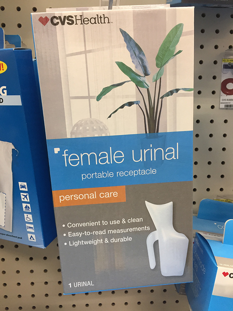
I began this journey in Quarter IV at the New England Institute of Technology in the UX/UI (User Experience/User Interface) course with Rick Mitchell. The assignment was to explore my local Supermarket or Bigbox store, find a poorUser-Centered Design(UCD) packaging category, and present a redesign of the product of my choice to significantly enhance its UCD. I visited my local CVS store and the product that immediately stood out to me was an unattractive CVSHealth brand female urinal and packaging. The design of the box was very generic, unappealing, and lacked any sense of feminine elegance. The product itself was not only an unattractive design but was treated as an after-thought it seemed, by appearing in the lower right-hand corner of the box.
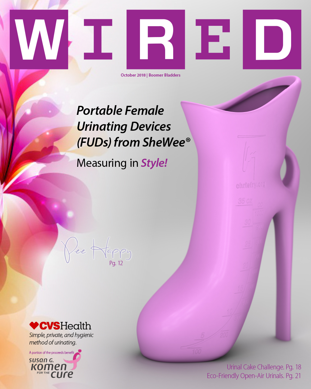
In Quarter V’s Concept Development course with Rick Mitchell, the assignment was to identify a tech “start-up” company to design a Value Proposition for and become the subject for a WIRED magazine cover and 3D model developed in a 3D Modeling course taught by John “Symko” Szymkowicz, an artist and educator at the New England Institute of Technology. Picking up where I left off in Quarter IV, the company I chose for the assignment was The Shewee @ Dales Distribution Ltd and the 3D model created in the Cinema 4D application would be a Female Urinating Device (FUD). Throughout this course we were challenged to develop a WIRED magazine cover value proposition with H1 and H2 tags, relevant buzzwords, keywords for Search Engine Optimization (SEO), and semantic search phrases.
“CVSHealth’s urinal looks like a bastardized blend between a cockeyed pitcher and Cher’s stiletto boot. No woman would desire to have this pointy contraption between their legs or have it on display in their homes. My ultimate goal in this project is to lose the crooked pitcher appearance entirely and emphasize the stiletto look to create a soft, feminine, and stylish urinal for women. Beauty that functions well, sells.”—Chris M. Fry
Collaboration
As a male designer, improving the overall product design for a female urinal was something I couldn’t do without the help of a female expert. I visited my local hospital and spoke with numerous medical professionals seeking their input. Mostly all of the staff members admitted to not knowing enough about the urinal to assist me with the project. Only one individual in the ICU department had the knowledge, expertise, and willingness to help me with the urinal design project. I consulted with Caitlin, RN BSN (Registered Nurse Bachelor of Science in Nursing) now at Lee’s Summit Medical Center, on every iteration of the CVSHealth box design. We discussed on several occasions not just the packaging design but also the urinal’s product design, UI/UX design, marketing initiatives (including urinal accessories), additional uses, and customer perceptions. Caitlin was instrumental in the product development phases and her expertise became an invaluable part of my product redesign journey and focused my creative energies on a project worth pursuing and adding to my bachelor’s degree program portfolio.

Box Redesign
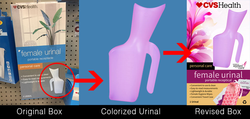
Improving the original product design began with masking-out the urinal image on the box in Adobe Photoshop and simply colorizing the CVSHealth urinal product. I chose a feminine pink color and placed it on the very top of the box layout. Ultimately, this colorized Adobe Photoshop image would be replaced by an actual 3D model created in the Cinema 4D application.
Enhancements, Goals, and UI/UX Design
- I not only wanted to improve the packaging but to improve the product itself.
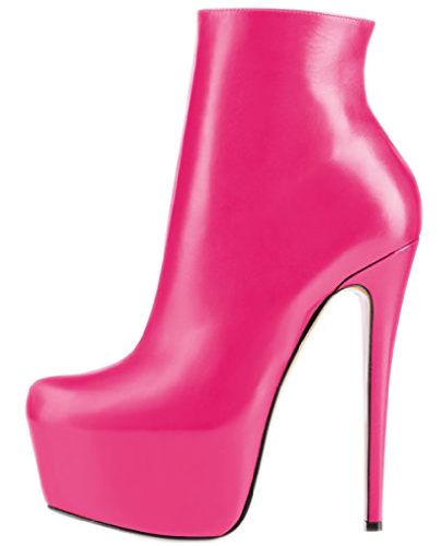
- The original product design reminded me of a woman’s high-heel shoe. I decided to model my redesign on this initial impression.
- I wanted to provide an embarrassment-free device for women to monitor I/O, fluid intake and output.
- Improving the product began with simply colorizing the original CVSHealth urinal product. I chose a feminine pink color and placed it on the very top of the box layout.
- I decided to add travel accessories at the bottom of the box such as female hygiene wipes and a convenient travel case.
- I consulted with Caitlin, a Registered Nurse in ICU at Yale New Haven Health on every iteration of the box design.
- Caitlin suggested adding the Susan G. Komen Breast Cancer Foundation logo on the front of the box. Donating a portion of each urinal sale to the breast cancer organization is a way to let women know that their personal care, would also aid in the care of other women.
- Caitlin also felt the recycle symbol was needed on the front of the box to let women know their care would also care for the environment.
- Finally, the original CVSHealth box mirrors the front design on the back of the box. I decided to include a quote from Caitlin on the back of my box design …
“It is important for people with multiple health problems to monitor their fluid intake and output. A decrease in urine production can be a significant and early sign of a decline in health. Women using this product have health problems significant enough that they cannot walk to the bathroom and void and/or defecate as a normal healthy woman—therefore it is important for the population purchasing this product to be aware of their output trends.”—Caitlin M, RN
Challenges
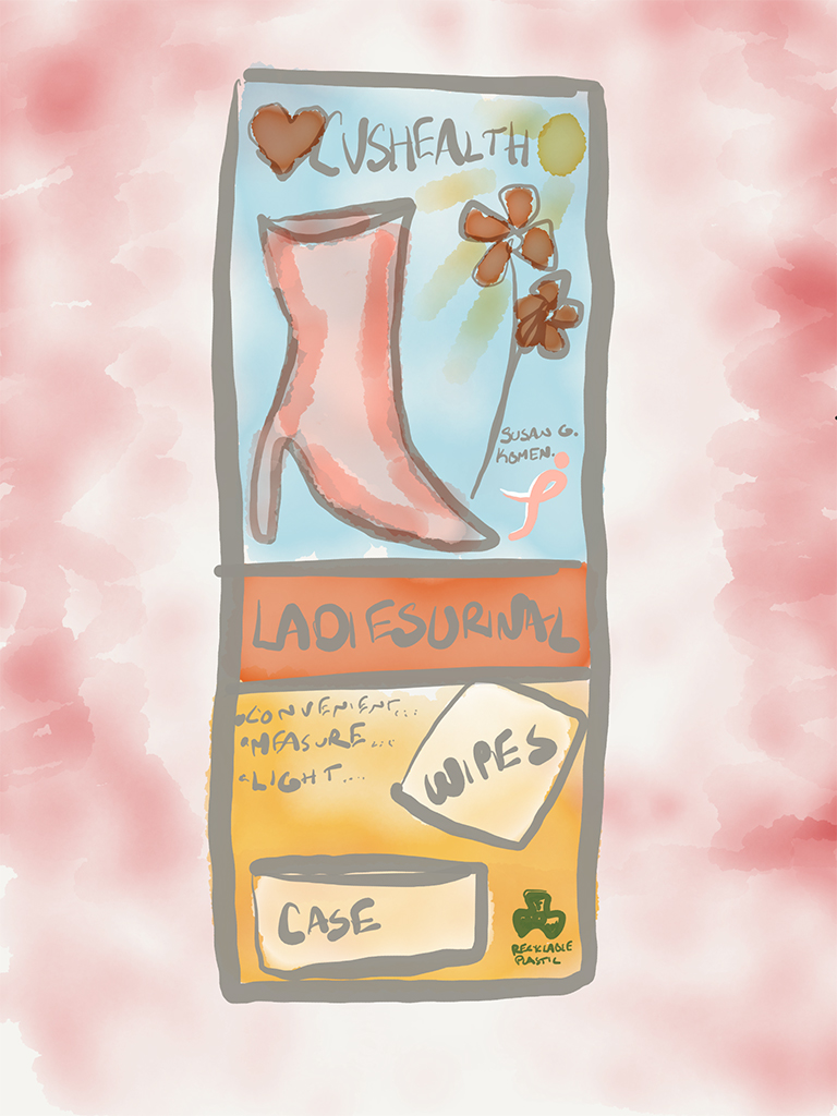
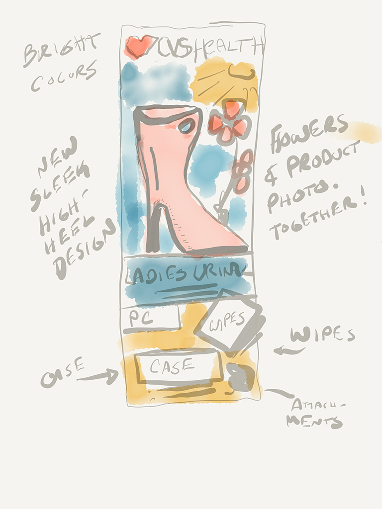
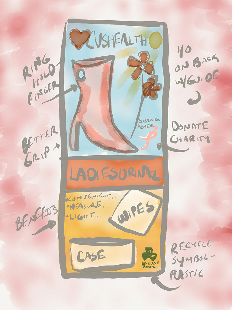
- The goal of the Value Proposition/3D model is to illustrate the improved urinal for women visually. Most urinals on the market today lack any style or feminine qualities.
- Women who are in need of a urinal will be drawn to the female color scheme, with an attractive high heel styled container. Shewee® makes a way to improve trips to toilets for women.
“The germs, doors that don’t lock, lack of loo roll; all things that women hate about (the usually disgusting) women’s public toilets can be solved with the use of a Shewee®.”
- My product design addresses the problem of displaying the urinal in public, by providing a more feminine appearance. The second concept sketch also displays feminine wipes for improved hygiene and travel bag.
- The Shewee @ Dales Distribution Ltd is a company addressing those needs, by creating products for “any lady, of any age, who doesn’t want to ruin their adventure because they need to go!”
Search Engine Optimization (SEO)
- Boomer Bladders
- Pee Happy
- Portable Female Urinating Devices (FUDs) from SheWee®. (h1)
- Measuring in Style! (h2)
- CVSHealth “Simple, private, and hygienic method of urinating.”
- Susan G. Komen for the Cure
- new-portable-female-urinary-device-fud-shewee-hygenic-pee-urinate-women-boomer-innovative-tech.png
Goals
- The end result goal offers women discreet, dignified, inexpensive, products with feminine sensibilities and meets all of their needs.
- My product design addresses the problem of displaying the urinal in public, by providing a more feminine appearance.
- Modifications from the first rough wireframe to now: the new design has a sleek, modern design with a feminine appearance are improved design affordances.
- The poignant Value Proposition H1/H2, SEO, CVSHealth quote, and the inclusion of the Susan G. Komen* foundation has been added—the idea is to donate a portion of each purchase benefitting a woman’s health cause.
*The Susan G. Komen Breast Cancer Foundation, often referred to as simply Komen, is the largest and best-funded breast cancer organization in the United States.
Supporting Quotes
In a paper given by Orde at the British Toilet Association (BTA), there is a massive pending need of female urinals for Boomers. In a survey of female urinals, “… of 521 women over the age of 15, the following results were given:
- 58% found public toilets dirty and held back urination
- 78% hover
- 48% of pregnant women will not use a public toilet
The article continues by stating “Portable women urinals could be of major significance and importance in outdoor events like pop concerts, or on construction sites (where there is now a law regarding this in Texas).”
Source: http://www.orde.info/wp-content/uploads/2013/08/Female-urinal.pdf
Initial FUD 3D Model
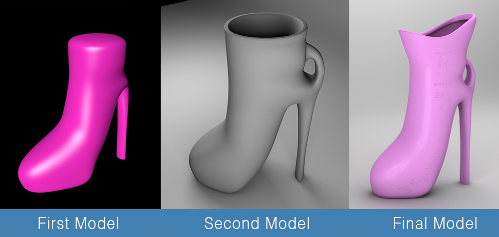
It became immediately apparent from my original 3d model created in the Cinema 4D application, that my design would need to be altered from my original sketches. The elongated bottom section would not be something females could easily measure I/O or even want underneath themselves. I began to rethink my design and began to alter it to be less “shoe-like” in its appearance and more receptacle-like in use.
3D Model Journey
My journey of making my design less “shoe-like” in its appearance and more receptacle-like in use began by shortening, softening, and rounding the bottom portion of the model. The second version of my 3D model included a small finger-loop to aid in stabilizing the urinal when held. I went back to the old drawing board and conceptualized yet another urinal sketch given my new desired parameters.
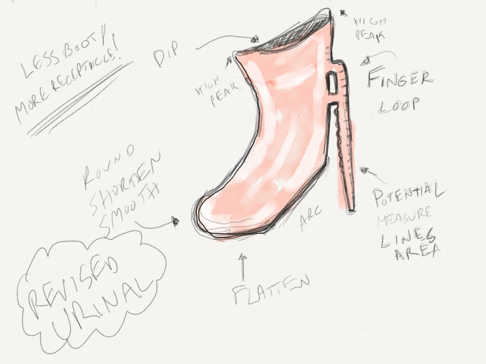
Once I completed the new sketch, it was time to build the urinal model in Cinema 4D with a whole new approach to the 3D model’s construction. My original 3D model used a “lofting” primitive but the new model was built using a block primitive and substrate surfacing. I added a camera, staging, lighting, and a plastic translucent material to the model’s surface. The original material was later dropped in favor of a solid material, which best displayed the measurement indicators for the WIRED magazine cover.
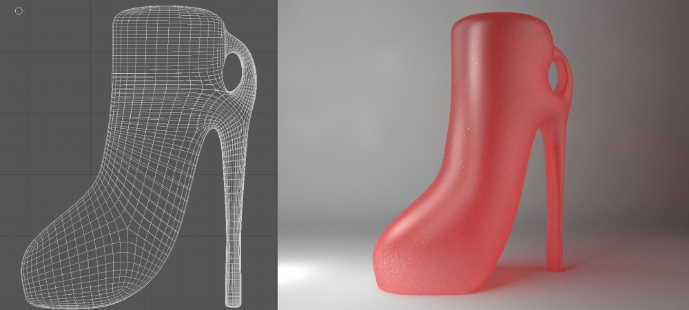
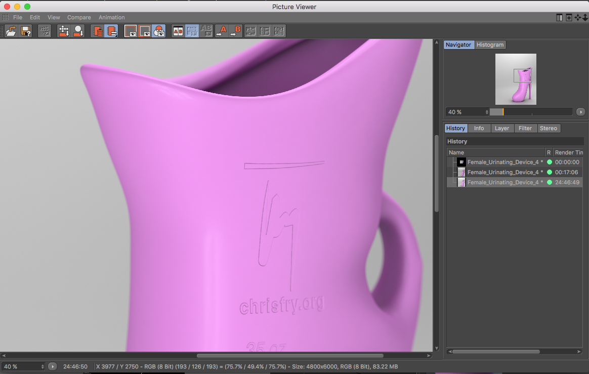
The final 3D model added an embossed measurement indicator with ounces (oz) along the left measurement line, cubic centimeter (cc) along the right measurement line, and my branded logo on the top of the measurement indicator. This process was accomplished by creating a B&W Adobe Illustrator file with the measurement design, and exporting it out as an Illustrator 8 file. The Illustrator file is then made into an Adobe Photoshop file and saved as a JPG.
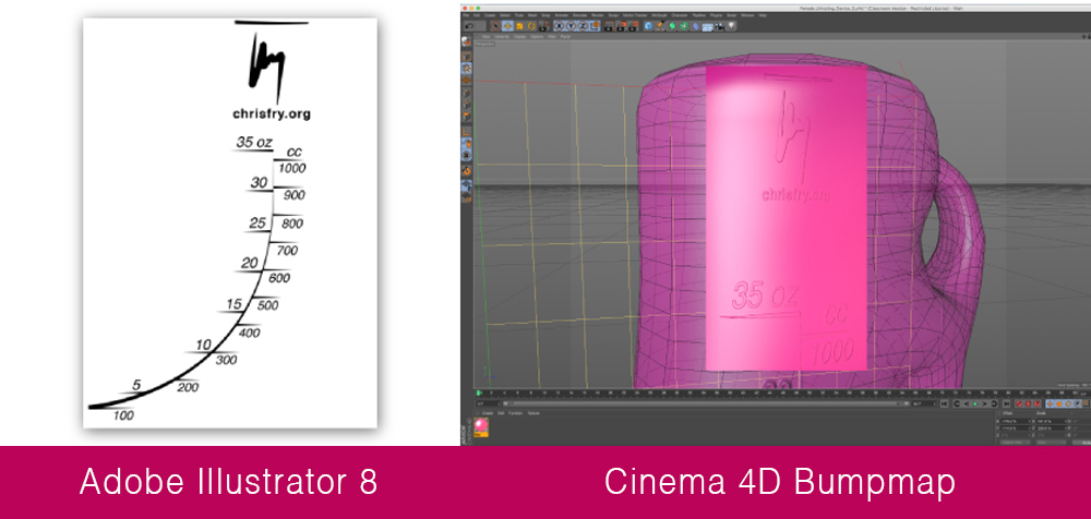
The last step was importing the file into Cinema 4D as a bumpmap image and placed on the urinal. The final step of the modeling process was to raise the urinal’s neck above the finger loop and add a smooth concave drop for increased comfort in actual usage.
Final 3D Render
The final model was positioned and staged for the WIRED magazine cover, placed under a two-light lighting setup, with minor tweaking to the camera view, and camera settings (F-stop, DOF, etc.). The rendering of the 3D model took over 24 hours to complete as it was rendered with ambient occlusion, anti-aliasing, and with the best physical rendering setting in the Cinema 4D application. The staging, clarity, and resolution of the final image was exactly what I was seeking for a magazine cover design but lacked the transparent plastic material needed for real-world usage. Without the translucent plastic material, it would be impossible for urinal users to measure their fluid intake and output.
WIRED Magazine Cover
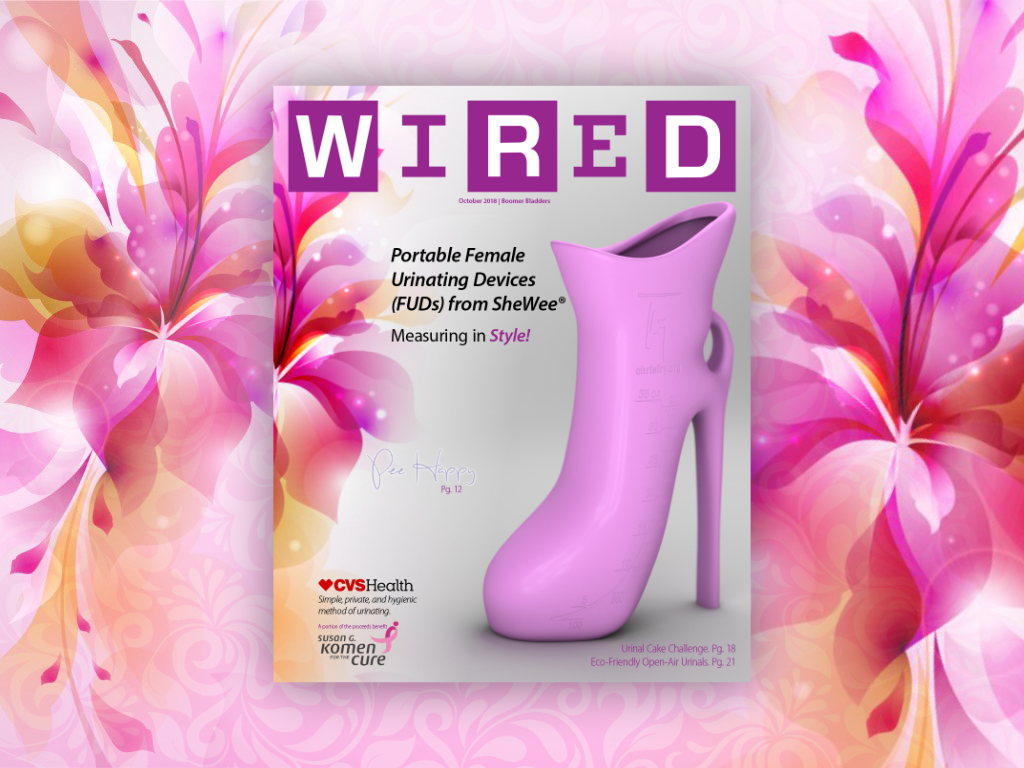
During the final Concept Development class, I discussed the 3D model’s lack of transparent plastic material needed for real-world usage with my instructor Rick Mitchell. We both agreed that the needs for the cover were satisfied and better represented with the solid material and that observers would not be focused on the lack of transparency. I finally imported the high-resolution 180 dpi rendering into a 16″ x 20″ WIRED magazine cover design that I created in Adobe InDesign. The final result was exactly what I had dreamed of at the beginning of my journey in Quarter IV’s New England Institute of Technology UI/UX course with Rick Mitchell.
