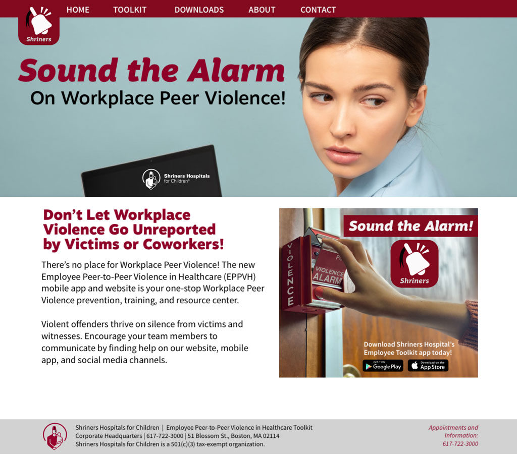
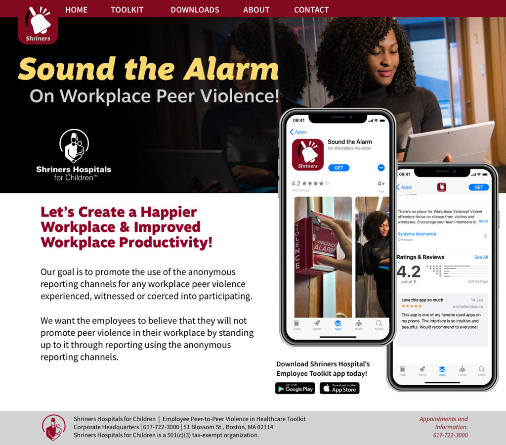
Workplace Safety Awareness System & Behavior Design
The Problem
Workplace safety messaging is often passive. Posters are ignored, emails are overlooked, and in high-stress situations, people hesitate or fail to act quickly because the message isn’t clear or urgent enough.
The challenge was to create a communication system that immediately captures attention, communicates urgency without confusion, and triggers a clear, instinctive response.
The Insight
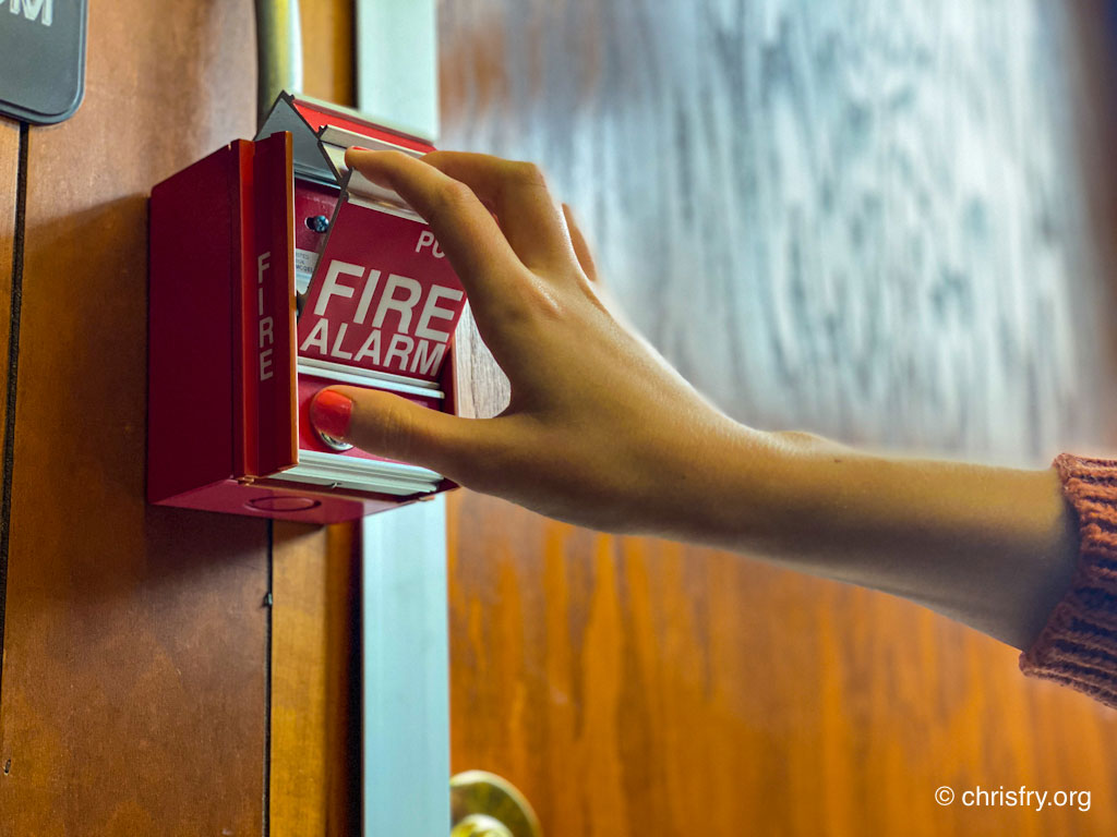
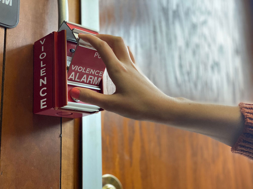
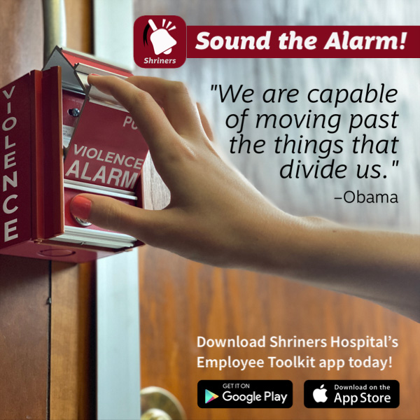
In an emergency, people don’t read. They react.
The most effective systems are not informational. They are recognizable, immediate, and behavioral. The concept was built around a universally understood interaction: the fire alarm. It’s not explained. It’s recognized. It doesn’t suggest action. It demands it.
The Approach
I reframed the campaign from awareness-based messaging to trigger-based communication. Instead of asking people to think, the system prompts them to act.
The design focused on familiar emergency cues, bold high-contrast visuals, simplified language, and consistent repetition across touchpoints. Each element reinforces a single idea: recognize the signal and respond immediately.
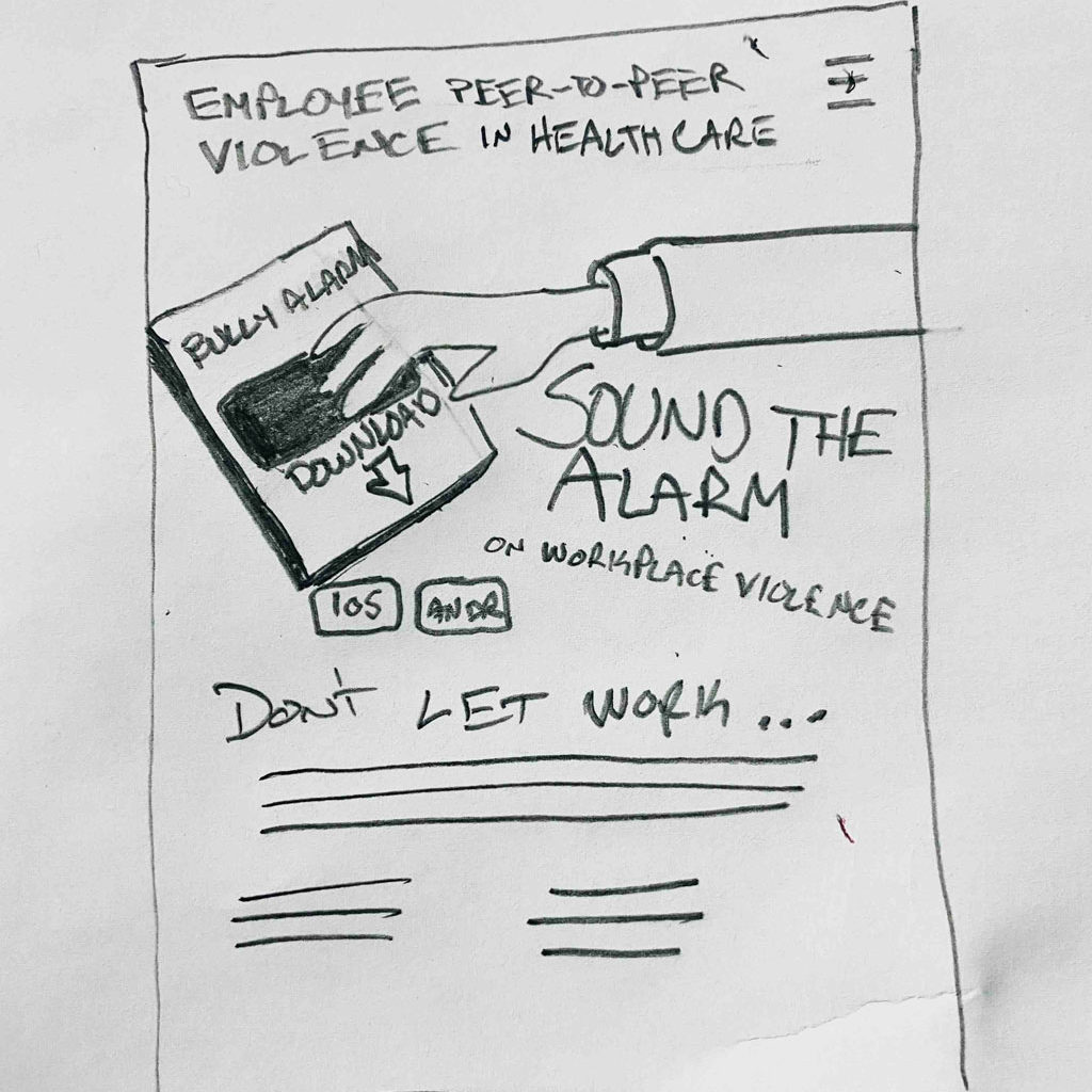
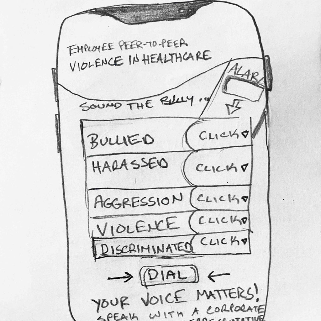
The System
The campaign was designed as a unified communication system applied across multiple environments, including environmental signage, printed materials, digital applications, and awareness messaging.
Every touchpoint supports the same behavioral loop: see it, recognize it, act.
Visual Execution
The system uses the visual language of emergency devices—alarm boxes, pull handles, bold red cues, and direct activation metaphors. These elements create immediate association with urgency and action.