Pequot Museum Mobile App
Early Mobile UX, Digital Strategy, and Platform Integration (2009–2010)
Overview
Between 2009 and 2010, I led the concept, UX strategy, visual design, and digital integration of one of the earliest museum mobile applications.
At a time when smartphones, social media, and mobile apps were still emerging, I built a unified digital experience that connected the museum’s web, social, and mobile platforms into a single, accessible system.
This work was part of a broader effort where I managed and developed nearly all of the museum’s early social media, internet, and mobile initiatives.
Context
- The iPhone and App Store were newly introduced
- UX/UI roles and standards were not yet established
- Museums had little to no mobile presence
- Social media was still being defined as a marketing channel
While most organizations were experimenting with individual platforms, I was already building an integrated digital ecosystem across multiple channels.
Problem
- Content was fragmented across website, blog, and social platforms
- There was no centralized mobile access point
- Users were unfamiliar with smartphone interfaces
- No established UX patterns existed for museum apps
The challenge was to create a mobile experience that was intuitive, unified, and usable for a broad audience with little to no mobile experience.
Approach
UX Strategy
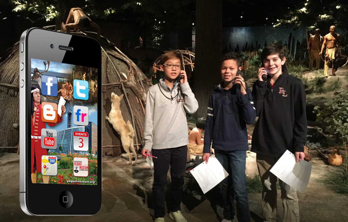
I designed the app using a familiar interaction model based on the native iPhone home screen:
- Grid-based layout
- Large, touch-friendly icons
- Minimal text
- Direct access to key destinations
This removed friction and allowed users to navigate the app immediately without instruction.
Platform & Development
I researched and selected SwebApps to develop and launch the application across iOS and Android platforms.
When SwebApps went out of business, I proactively evaluated replacement platforms, including Conduit Mobile, maintaining ownership of the product lifecycle until the initiative was paused due to budget changes.
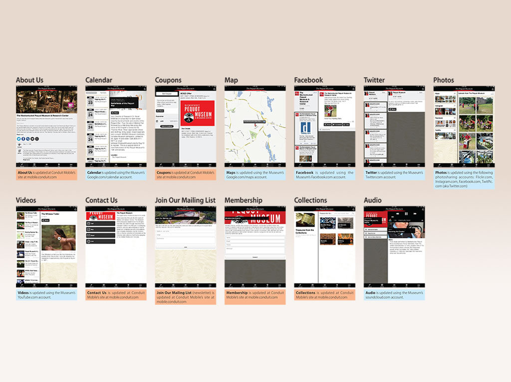
Content Architecture
I structured the app as a centralized hub connecting:
- Social media platforms (Facebook, Twitter, Flickr, YouTube)
- Blog and digital content
- Event calendar
- Directions and visitor information
- Contact and membership access
I designed the system so content updates across these platforms flowed into the app, reducing manual maintenance and keeping the experience current.
Digital Strategy Integration
In parallel, I developed and managed the museum’s early digital presence, including:
- Social media growth across multiple platforms
- Cross-promotional campaigns and partnerships
- Early mobile and location-based marketing efforts
- Content publishing workflows and scheduling systems
The mobile app served as a natural extension of this ecosystem, acting as a centralized access point for all digital activity.
Visual Design
I created the interface and visual system to prioritize usability:
- Icon-driven navigation
- Clear visual hierarchy
- Minimal reliance on text
- Branded, immersive imagery
Design decisions were driven by usability first, while maintaining alignment with the museum’s identity.
Outcome
- Delivered one of the earliest museum mobile applications in the space
- Positioned the organization as an early adopter of mobile and digital integration
- Extended access to museum content beyond the physical visit
- Created a scalable system connecting web, social, and mobile platforms
- Increased engagement through unified digital channels
Key Contributions
- Led UX concept, structure, and navigation design
- Designed the visual interface and user experience
- Researched and selected development vendor (SwebApps)
- Built and structured the content integration system
- Managed the museum’s broader digital and social ecosystem
- Evaluated and planned post-launch platform continuity
The Power Move
This wasn’t early UX work.
This was UX before UX had a name.
Instead of following established best practices, this work defined them in real time—using instinct, observation, and platform constraints to create something usable before patterns existed.
At a time when most organizations were experimenting with isolated tools, this approach treated mobile, social, content, and user behavior as a connected system, not separate channels.
What may appear primitive by today’s standards reflects something more important: early system-level thinking applied to emerging technology.
This wasn’t behind the curve.
It was ahead of it.